It is no secret that climate change is happening - and it is especially noticeable where I live. We have been under water restrictions for about ten years now in one form or another - mostly sprinkler bans and the like, plus lots of TV advertising encouraging us to take shorter showers, install rainwater tanks and save as much water as possible.
For students (an adults) it may be a bit hard for them to understand why this is all taking place, and while the science of climate change is complicated there is no doubt from the weight of evidence that we are to blame for much of it, and compounding other natural forces.
There are two places to get really good visual data on this change in climate and how it effects our water supply and way of life here in Perth.
The WA Water Corporation has a great website that has some great resources for showing what has happened over the last 100years, and what we can do about it. It also runs a water wise school program and incursion program.
The Bureau of Meteorology has one of those websites that looks boring but has a massive amount of information that is really easy to access.
They also have real-time radar and satellite maps so if there is a cold front coming over you can track it as it dumps rain.
The climate maps for rainfall, temperature and vegetation all have archives that allow you to compare year to year changes in colour coded maps.
A blog of stuff I have found for interactive Whiteboards, Audience Response Systems, slates, tablets and other educational hardware.
Showing posts with label data. Show all posts
Showing posts with label data. Show all posts
Thursday, October 13, 2011
Wednesday, August 12, 2009
Lies, Damn Lies and Statistics
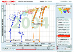
 gapminder.jpg" style="border: medium none ; display: block;" width="240" height="169">Image by guspim via Flickr
I have blogged about gapminder before - a great way to visualize data over time. Only problem is is that the information is still very dense, plus you have to be online to access this application.
So for a different application try StatPlanet. You can use it online or there is a download version as well. It only looks at 2000 and 2005 data, but maps it out on world and regional maps. the statistics are from the same place as Gapminder - UNESCO.
You can also down load software to make your own maps and charts with your own data.
This is great for both mathematics and Society and environment. It work well on an IWB as well so great for introducing a topic or statistics.


Saturday, November 8, 2008
Mind the gap!!
I keep forgetting how cool TED.com is.
I was watching a few videos while the other half was watching a chick flick in the lounge room. (yes we only have one TV in our house and sometimes even that is too many).
And came across this little gem - http://www.ted.com/index.php/talks/hans_rosling_shows_the_best_stats_you_ve_ever_seen.html
Followed it up and went to his website - this is the coolest way to play with statistics I have ever seen. Click on Gapminder world and you can visually see a whole range of data and how it related to other data all from places like the UN and it's agencies.
OK so not strictly something that I would use on an interactive whiteboard but - well you can - each bubble is clickable and the whole graph is interactive. Actually it would work quite well with eBeam or a Wacom tablet now that I think about it.
Subscribe to:
Posts (Atom)


 Reblog this post [with Zemanta]">